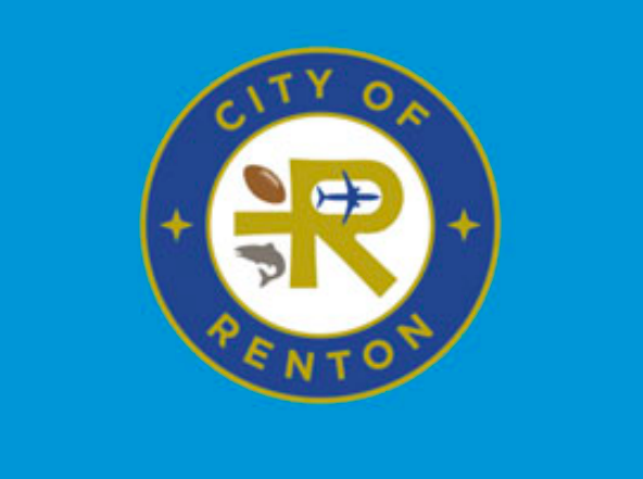
The City of Renton’s current logo, shown above, includes images representing Renton’s significance as the birthplace of commercial jet aviation, the headquarters of the Seattle Seahawks, and the host of one of our region’s key salmon runs.
The City of Renton is considering dumping the images in the City’s logo that set our community apart from others. At last Monday’s Committee of the Whole Meeting, the Council was presented with a staff proposal to “refresh” and “simplify” the City’s logo. The proposed new logo would drop the airliner, football, and salmon from the logo. The new logo would appear as in the picture below.
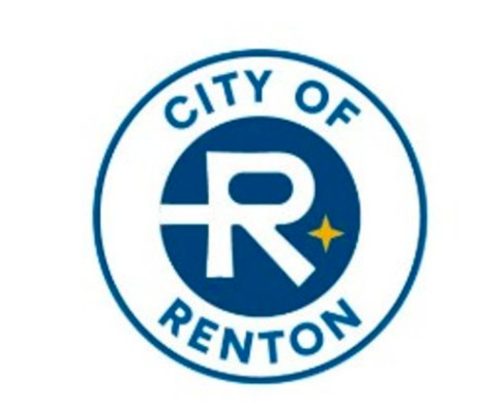
The proposed new logo removes the Renton-specific icons, and just keeps one of the two generic four-pointed stars in the current logo.
Dropping community-focussed images is a departure from our neighboring cities’ approach, as well as a change to Renton’s approach of the last 60 years. Below are some logos from nearby cities, including images like a sailboat conjuring Des Moines’ impressive waterfront, a waterfall representing Snoqualmie, a tree-covered island for Mercer Island, a maple leaf for Maple Valley, and trees and mountains and water images for other cities.
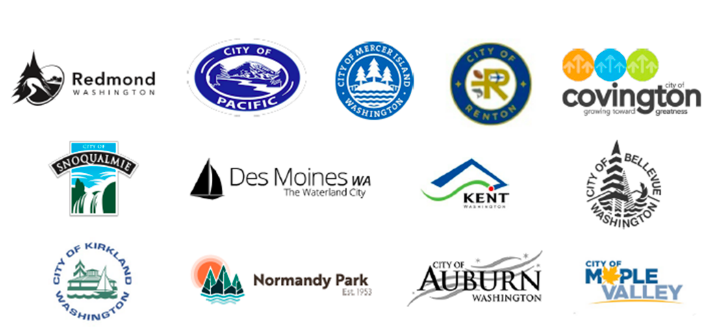
Our neighboring cities use icons of waterfalls, trees, sailboats, mountains and even a maple leaf to project their community in their logo.
As a career airplane designer, I feel a special connection to the commercial airliner in Renton’s logo, as it recognizes our city’s importance as the world’s birthplace of commercial jet aviation. The salmon in the logo acknowledges Renton’s natural environment. and the significance of our Cedar River as home to the largest natural-origin Chinook Salmon run in the Lake Washington Watershed, as well as a key spawning ground for Coho and Sockeye salmon. The football (which I half expected to soon see paired with a soccer ball) reflects our identity as a headquarters for professional sports, and Renton’s overall support of recreation and entertainment.
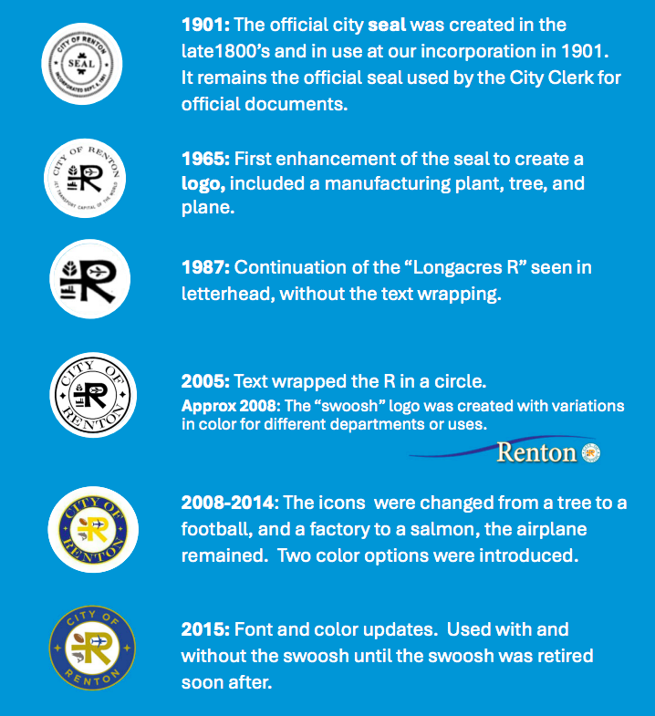
This chart shows the evolution o Renton’s logos during the decades. The first Renton-specific icons were added to the logo 60 years ago.
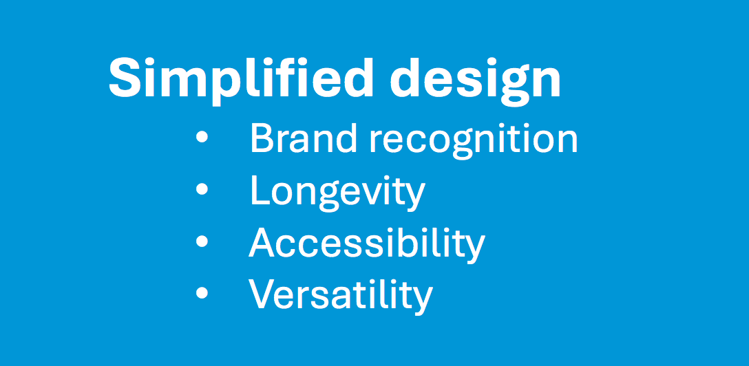
The presentation to City Council justifies the change as a “simplified design.”
The Committee of the Whole briefing is not the final word on this topic. Before the decision becomes final, the Council has to formally pass legislation implementing the simplified logo.
[Update 2/3] Fortunately, several council members expressed concerns about the proposal, and have so far prevented this staff proposal from advancing. Ed Prince was very vocally against the logo change, along with Ruth Pérez & James Alberson and Valerie O’Halloran. Two members were absent from the discussion. The topic has so far not been reported out of committee.
The full details of the proposal can be found here, as well as the staff’s proposed phase-in plan. Anyone with an opinion on this issue can write to the Council at council@rentonwa.gov, or write to the Mayor at mayor@rentonwa.gov.
Recent Comments