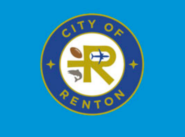
The City of Renton’s current logo, shown above, includes images representing Renton’s significance as the birthplace of commercial jet aviation, the headquarters of the Seattle Seahawks, and the host of one of our region’s key salmon runs.
The City of Renton is considering dumping the images in the City’s logo that set our community apart from others. At last Monday’s Committee of the Whole Meeting, the Council was presented with a staff proposal to “refresh” and “simplify” the City’s logo. The proposed new logo would drop the airliner, football, and salmon from the logo. The new logo would appear as in the picture below.
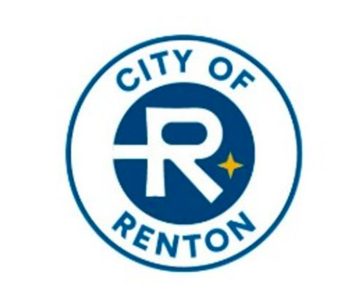
The proposed new logo removes the Renton-specific icons, and just keeps one of the two generic four-pointed stars in the current logo.
Dropping community-focussed images is a departure from our neighboring cities’ approach, as well as a change to Renton’s approach of the last 60 years. Below are some logos from nearby cities, including images like a sailboat conjuring Des Moines’ impressive waterfront, a waterfall representing Snoqualmie, a tree-covered island for Mercer Island, a maple leaf for Maple Valley, and trees and mountains and water images for other cities.
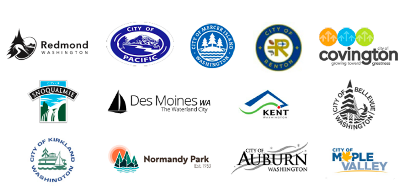
Our neighboring cities use icons of waterfalls, trees, sailboats, mountains and even a maple leaf to project their community in their logo.
As a career airplane designer, I feel a special connection to the commercial airliner in Renton’s logo, as it recognizes our city’s importance as the world’s birthplace of commercial jet aviation. The salmon in the logo acknowledges Renton’s natural environment. and the significance of our Cedar River as home to the largest natural-origin Chinook Salmon run in the Lake Washington Watershed, as well as a key spawning ground for Coho and Sockeye salmon. The football (which I half expected to soon see paired with a soccer ball) reflects our identity as a headquarters for professional sports, and Renton’s overall support of recreation and entertainment.
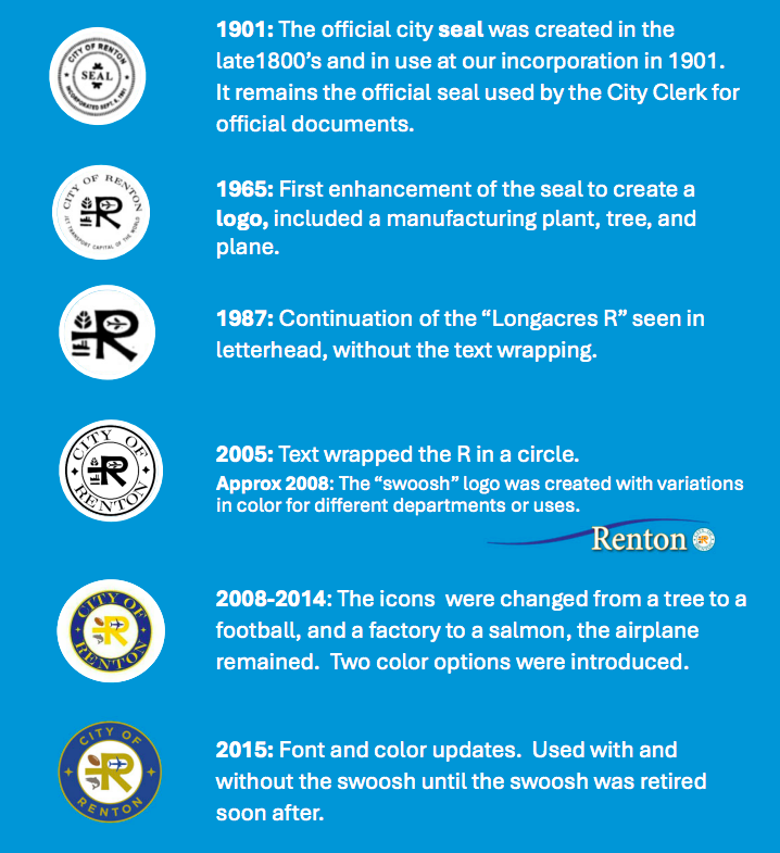
This chart shows the evolution o Renton’s logos during the decades. The first Renton-specific icons were added to the logo 60 years ago.
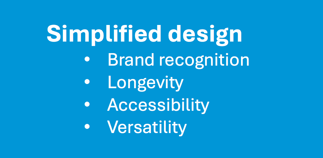
The presentation to City Council justifies the change as a “simplified design.”
The Committee of the Whole briefing is not the final word on this topic. Before the decision becomes final, the Council has to formally pass legislation implementing the simplified logo.
[Update 2/3] Fortunately, several council members expressed concerns about the proposal, and have so far prevented this staff proposal from advancing. Ed Prince was very vocally against the logo change, along with Ruth Pérez & James Alberson and Valerie O’Halloran. Two members were absent from the discussion. The topic has so far not been reported out of committee.
The full details of the proposal can be found here, as well as the staff’s proposed phase-in plan. Anyone with an opinion on this issue can write to the Council at council@rentonwa.gov, or write to the Mayor at mayor@rentonwa.gov.

The weird little glyphs signal that this logo has some history. Without them, it’s just a really ugly R. If you told me the R came from a typeface called “Zapf Derpy,” I’d believe you.
The R by itself is horrid isn’t it. The older logos has a reason for looking so weird, but if they’re going to change it, it should either hold on to the past or break cleanly from it.
You can also see how horrid computers can be a keming. Everything past 2005 has way too much space around the “I” in City. And when I say keming, I mean kerning.
The proposed new logo is so devoid of any personality, is this what Renton is becoming? And what exactly does the 4-point gold star represent? I was proud of the past logos that identified Renton’s uniqueness, and personality. An airplane for Boeing and the 737 made here in Renton which is along the shores of Lake Washington & the Cedar River famous for salmon, is a source of pride for young and old. The new Renton logo next to all those neighboring cities logos is embarrassing.
Yes, what exactly what does that 4-point star stand for……
It’s pretty generic, and not necessarily Renton specific.
There could be lots of different meanings for a four-pointed star.
One could think of it as a compass rose, for wayfinding, tying into our aviation background. But as a former aviation safety manager, if a compass is required for safety, then there should be at least one backup for redundancy. There are two on our existing seal. 🙂
Ironically, the part of the logo they are keeping, the letter “R”, contains a hidden reference to our (sadly) long-gone Longacres horse racing track- which in fairness no longer represents us. Called the “Longacres R”, I believe the circle of the R derives its elongated oval shape and tail from the shape of the track at Longacres when viewed from above.
See theses horses going in around in circles? Make our logo like that. Give it legs too.
Ha! Renton used to have hundreds of resident horses, and thousands of visiting horses every summer when Longacres was operating (prior to 1992). We don’t have as many anymore. So as much as I would personally love a horse logo, I’m not sure it would be right. One of Renton’s remaining horses has lived at our house for the past 25 years. He was born in the wild so his birthdate is approximate; we think it was in 1992– coincidentally the same year Longacres closed.
Love how you and your family care for Animals. Are you grandfathered in for horses – looking at the rules, I seems my property can’t even have a goat.
Thanks for the kind words. Our home is on an 1.25 acres, and in Renton a single-family residence can maintain up to two large farm animals and some medium and small farm animals if it is an acre or more. Here is a link to the code.
Just this morning I was just telling one of my students (who loves horses) about longacres and how many horses used to live in Renton. There are a lot of people that wish we still had more horses around!
Chat-GPT give me a generic city roundel for the City of Renton. Base it off of something that fits a 5,000 population Midwest town plagued by both tornadoes and flooding, but modernize it like you did for the Cracker Barrel logo. Add a star because we’re special.
When I first saw the new logo, I thought the realtors might complain that just the letter R by itself is a trademark infringement. Here is their logo: